

Dairy Queen Logo: A Look at Its History and Hidden Meaning
![]()
![]()
A Brief History
-
Dairy Queen was founded in 1940 in Joliet, Illinois. (Wikipédia)
-
In its earliest years, the logo was a simple wordmark-style sign, sometimes paired with a soft-serve cone image. (logos-marques.com)
-
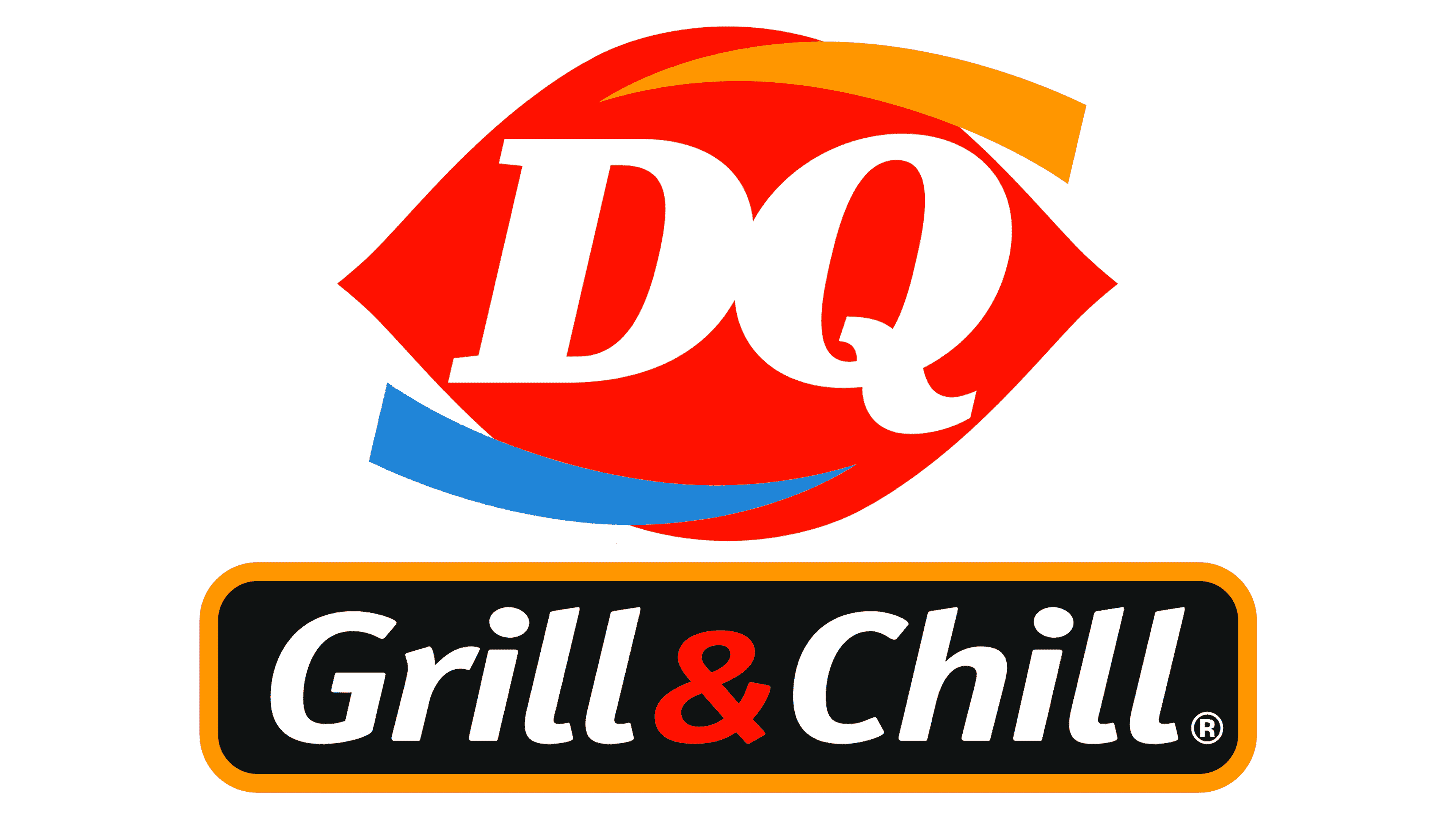
By around 1960, the company adopted a bold red ellipse-shape logo with the words “Dairy Queen” in white. This would become highly recognizable. (Logos World)
-
In 2001 and then more fully in 2007, the logo was updated to emphasize the acronym “DQ” and added design elements like coloured swooshes (blue and orange) around the red shape. (Mashed)
The Logo’s Hidden Meaning & Design Elements
The modern Dairy Queen logo looks simple on the surface, but designers included a number of symbolic details:
-
The red ellipse (or droplet-like shape) has been interpreted as resembling lips, giving the brand a friendly, inviting character. (Homemaking.com)
-
In the 2007 version:
-
The italicized “DQ” letters and updated font in 2007 were meant to reflect the company’s evolution—moving from purely soft-serve dessert to a broader fast-food format. (logos-marques.com)
Why This Matters
-
The logo communicates that Dairy Queen is not just about ice cream—it covers both hot meals and frozen treats, which the colour cues emphasize.
-
The persistence of the red shape links the brand’s modern identity to its heritage, helping evoke nostalgia while signalling freshness.
-
For many customers, seeing the familiar red “ellipse” or “lips” shape quickly identifies a DQ location—even before reading the text.
A Few Fun Facts
-
The red-lips design from the 1960s lasted for over 40 years before major redesigns. (Mashed)
-
The acronym “DQ” became official in many markets around 2001. (logos-marques.com)
-
The additions of the orange and blue arcs are relatively recent (2000s) but carry intentional meaning tied to the product lines. (Mashed)
Final Thoughts
The Dairy Queen logo is more than just a catchy sign—it's a visual story of a brand that started with soft-serve and grew into a full-service food chain. The red lips-ellipse taps into familiarity and comfort, while the blue and orange arcs quietly communicate what the company offers: cold desserts and hot meals. Next time you spot a DQ sign, you’ll know there’s a lot more going on than meets the eye.


0 comments:
Post a Comment